Adys Road
New infill: how to do it (1)
Wed, 15/04/2009 - 19:17 — eileen
This is much more interesting. With the quasi mansard roofline, projecting parapets and dormers the planners were clearly persuaded it matches its neighbours. Well sort of, but this little development clearly has its own agenda. I like the fact the materials and detail make no effort to reflect the adjacent houses: the second hand stock brickwork, sooted white-washed and all, the simple treatment of the first floor windows, and those crazy steep dormers all work reasonably well creating an interestingly articulated facade. Note the barely perceptible off-street parking . Not that outstanding a development but quite a good try.
New infill: how not to do it (2)
Wed, 15/04/2009 - 18:49 — eileen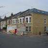
This is marginally better. At least the windows are more or less correctly proportioned but there is no disguising the fact that it is a different type of building from its Victorian neighbours. The bays are clumsily proportioned, the walls are cavity brickwork and therefore stretcher bonded and of course there are no chimneys. It just doesn't look right.
New infill: how not to do it (1)
Wed, 15/04/2009 - 18:22 — eileen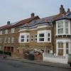
Just what is going on here? The scale and proportion of the new pair of houses is execrable in the extreme. I suppose you can work out what the developer was trying to do; squeeze three habitable stories into two, but in doing so has introduced a totally confusing sense of proportion and then compounded it by weak and feeble detailing. Note the simple assurance of the original houses on the right. The 1950s development on the left at least has no pretensions. We shouldn't be doing stuff like this today.